Education hub · Theory
Colour theory
on the wheel.
Hue, chroma, temperature, value, contrast, and the harmonies that make outfits sing. For the principles behind personal colour analysis, start with What Colour.
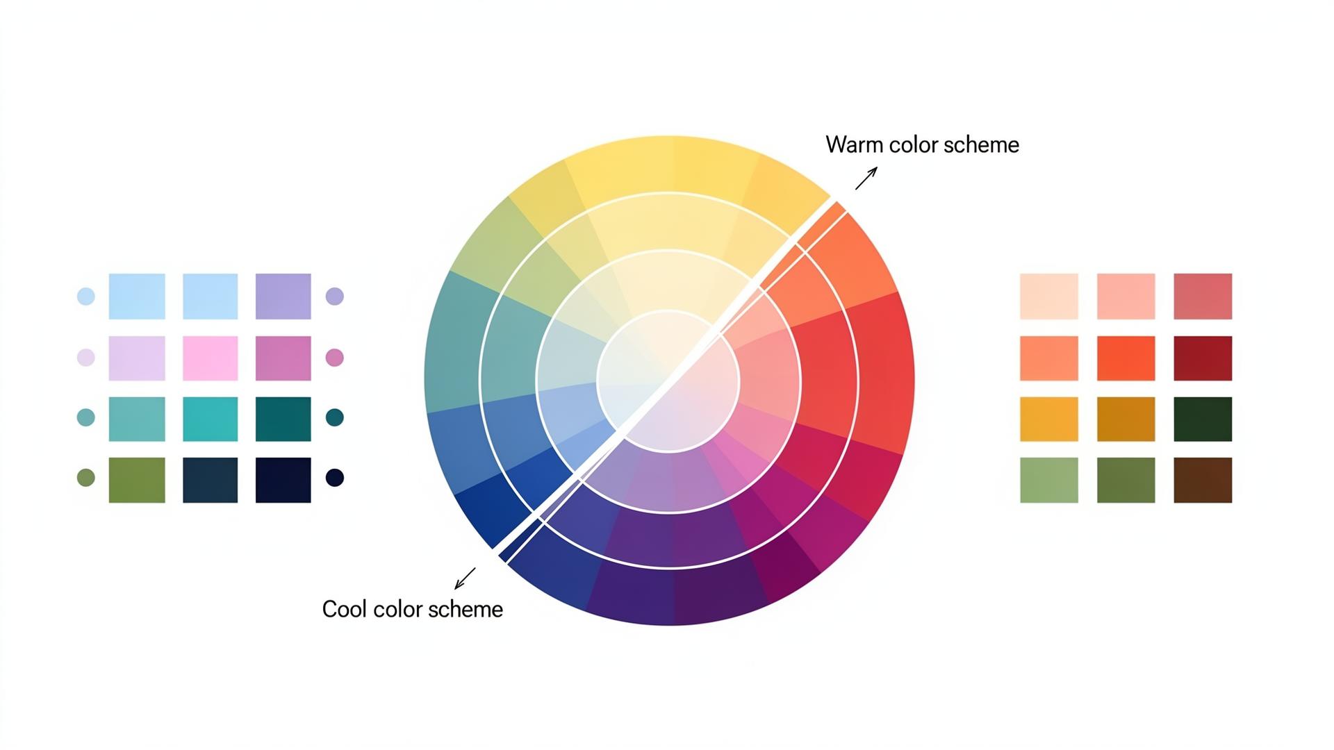
A map for the eye
Twelve hues. Five rings.
One language.
Every personal colour conversation begins on a wheel like this. The outer ring shows the twelve pure hues. Move inward and you'll see the same hue softened with white (a tint), greyed (a tone) or deepened with black (a shade). Hold this picture in your mind as you read the eight foundations below, they are simply names for the moves you can make on this wheel.
Three families
Primary, secondary, tertiary
- Primary · Red, yellow and blue. The three hues that cannot be mixed from anything else, every other colour on the wheel descends from these.
- Secondary · Orange, green and violet. Made by mixing two primaries in equal parts. They sit exactly between their parents on the wheel.
- Tertiary · The six in-between hues, red-orange, yellow-orange, yellow-green, blue-green, blue-violet, red-violet. A primary mixed with its neighbouring secondary.
Chapter two
The eight foundations
Every colour can be described by these eight properties. Master them and you can speak about any shade, paint, fabric, lipstick, with the same vocabulary an analyst uses.
Foundation 01
Hue
The pure colour family, red, blue, green, yellow, before any white, grey or black is added.
Why it matters. Hue is the starting point. Every other property below is a way of modifying a hue. When stylists say 'the wrong reds wash you out', they mean a specific hue family clashes with your undertone.
Example · Tomato red, fire-engine red and burgundy are all the hue 'red', what changes is value, chroma and temperature.
Foundation 02
Chroma
How pure or 'dusty' a colour is. High chroma reads as jewel-clear; low chroma reads as soft and powdery.
Why it matters. Chroma is the single most decisive property in personal colour analysis. Each season has a chroma comfort zone, a Soft Summer is destroyed by a high-chroma fuchsia, while a Bright Winter is dulled by a low-chroma sage.
Example · Emerald (high chroma) versus moss (low chroma), same hue family, very different mood.
Foundation 03
Temperature
Whether a colour leans warm (yellow base) or cool (blue base). Every colour sits somewhere on this axis.
Why it matters. Your skin has its own undertone, warm, cool or neutral. Wearing fabrics that match your undertone makes skin look even and lit; clashing temperatures cast a grey or sallow shadow under the jaw.
Example · Ivory (warm white) versus optic white (cool white). Both are 'white', but only one will harmonise with your skin.
Foundation 04
Value / Depth
How light or deep a colour appears in black-and-white. Pastel pink and burgundy share a hue but live at opposite ends of the value scale.
Why it matters. Value controls outfit weight. Light-value people (blonde hair, fair skin, light eyes) are overpowered by very deep values; deep-value people (dark hair, deep eyes) are washed out by very light values worn alone near the face.
Example · Squint at your wardrobe, what you see is value, not colour.
Foundation 05
Tint, Tone & Shade
Three ways to modify a single hue: + white = tint, + grey = tone, + black = shade.
Why it matters. This is the vocabulary of palette building. A 'Soft' season lives in tones; a 'Light' season lives in tints; a 'Deep' season lives in shades. Same hue family, completely different palette behaviour.
Example · Pink (tint of red), rose (tone of red), burgundy (shade of red).
Foundation 06
Saturation
Closely related to chroma, how vivid the pigment reads on the eye. Saturated colours feel loud; desaturated colours feel quiet.
Why it matters. Saturation governs how 'present' an outfit feels in a room. The trick of personal colour is matching the saturation of your fabric to the natural saturation of your face.
Example · Neon coral versus terracotta, same hue family, opposite saturation.
Foundation 07
Contrast
The distance between the lightest and darkest notes in an outfit, or in a face.
Why it matters. If your hair, skin and eyes have a wide value spread (e.g. dark hair + fair skin), high-contrast outfits feel natural. If your features sit close in value, low-contrast outfits feel harmonious, high contrast looks costume-y.
Example · Black with white = high contrast. Camel with cream = low contrast.
Foundation 08
Bright vs Muted
Clear, candy-bright colours versus painterly, dusted-down ones. The 'clarity' axis of personal colour.
Why it matters. Brightness sits on top of every other property. Two colours can share hue, value and temperature and still belong to different seasons because one is bright and the other is muted.
Example · Cobalt blue (bright) versus denim blue (muted).
The science
Warm vs cool, it's all undertone
Every colour in the visible spectrum has a bias toward either yellow (warm) or blue (cool). The same is true of human skin. Skin gets its colour from three pigments, melanin (brown), carotene (yellow) and haemoglobin (red-blue), and the ratio between them creates a dominant undertone that sits underneath surface tone, tan, redness or freckles.
Why your skin reacts
Fabric absorbs some wavelengths of light and reflects others back onto your face. When the wavelengths reflected match the undertone of your skin, the two cancel out evenly, skin reads as smooth, lit and even. When they clash, the opposite wavelength is amplified: yellow fabric on cool skin pushes blue undertones forward as grey shadow; cool blue fabric on warm skin pushes yellow forward as sallowness.
How to read your own undertone
- · Veins on the inner wrist look green → warm (yellow undertone).
- · Veins look blue or purple → cool (blue undertone).
- · Gold jewellery flatters → warm. Silver flatters → cool.
- · Skin tans easily and rarely burns → usually warm. Skin burns then freckles → usually cool.
How the four seasons sit on the temperature axis
Personal colour analysis splits humans into four temperature families, each tied to undertone. Seasons are not about birthdays, they are about the pigment running under your skin.
Warm · yellow undertone
Spring & Autumn
Spring runs warm and light/bright (peach, coral, golden ivory). Autumn runs warm and deep/muted (rust, olive, terracotta, camel). Both flatter skin with a golden bias.
Cool · blue undertone
Summer & Winter
Summer runs cool and soft/muted (powder blue, rose, lavender, dove grey). Winter runs cool and deep/clear (icy white, jewel sapphire, true black, magenta). Both flatter skin with a pink-blue bias.
The temperature axis is the first cut. Once you know whether you sit in the warm or cool half, the other foundations, value, chroma, contrast, narrow you down to one of the twelve sub-seasons.
The clarity axis
Bright vs muted
Independent of temperature, every colour also has a clarity reading, clear and saturated, or dusted-down and painterly. This is what separates a Bright Winter from a Deep Winter, or a True Autumn from a Soft Autumn.
Chapter three
The colour wheel
Tap a wedge to set your base colour, then switch harmony rules to see the palettes build themselves. Six classical relationships every stylist relies on.
Opposites on the wheel, maximum vibrance and contrast.
The six harmonies at a glance
A reference card of the relationships above, the same logic the interactive wheel uses, drawn statically so you can scan them side by side.
Rule
Monochromatic
One hue, varied in tint, tone and shade.
Rule
Analogous
Three neighbours on the wheel, quiet harmony.
Rule
Complementary
Direct opposites, maximum contrast.
Rule
Split-complementary
A hue plus the two beside its opposite.
Rule
Triadic
Three hues evenly spaced, vivid and balanced.
Rule
Square
Four hues in a square, bold, full-spectrum.
Chapter four
Micro lessons
Tap a card to reveal the answer. Eight short, glanceable explanations.
Test yourself
Three-question check
Quick, see what's stuck.
Mini quiz · 1 / 3
Which pair is COMPLEMENTARY?
Ready to find your own palette?
Take the quiz to find your season, then drape your face with the twelve seasonal palettes.