

You spot a jumper online. The colour is beautiful. The model looks fantastic. The reviews are glowing. A few days later it arrives. You try it on. It's fine. Not terrible. Not brilliant. Just not quite right. So it gets folded away, pushed to the back of a drawer. Six months later the tag is still attached. Sound familiar?
If you've ever stood in front of a wardrobe full of clothes thinking I have nothing to wear, you are genuinely not alone. And you're not bad at shopping. You're just missing a piece of information that nobody ever really teaches us.
The numbers are stranger than you'd think
Before we get into why it happens, it's worth knowing how widespread this actually is. Because it's not just you having a slightly disorganised wardrobe.
unworn for over a year.
to the UK industry.
owns. 31 never get worn.
WRAP's 2022 research, the largest study of UK clothing habits ever undertaken, found that British wardrobes collectively hold around 1.6 billion unworn items. Not mislaid. Not at the dry cleaner. Just hanging there, unloved.
A separate survey by Cancer Research UK found that nearly a quarter of us admit to buying clothes on impulse that we rarely wear, and over a quarter buy specifically for occasions that may only come round once. The most commonly cited reason for keeping unworn items? They don't fit. But the second and third? I've gone off the look of them, and I'd feel bad getting rid of them. That last one is doing a lot of work.
The almost-right problem
Most unworn clothes have something in common. They were almost right. Almost the right colour. Almost the right occasion. Almost the right version of ourselves we had in mind when we bought them.
The problem is that almost right rarely becomes a favourite. The things we reach for again and again tend to feel easy, comfortable, instantly recognisable as us. The almost-rights just hang there quietly while we pull on the same four pieces every week.
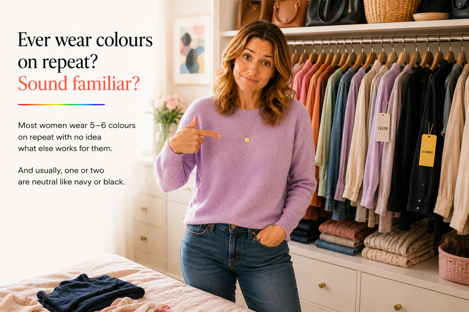
We tend to blame ourselves for this. We decide we need to get organised, try the capsule wardrobe, do the big clear-out, feel briefly virtuous and then somehow end up buying more things that don't quite work. The problem isn't discipline. It's information.
We don't buy clothes. We buy a feeling.
Shopping is emotional. We're rarely buying a jumper. We're buying an idea, of feeling more pulled together, more confident, somehow more like the version of ourselves who has it sorted.
Sometimes we buy for the life we wish we had rather than the one we actually live. That's why most wardrobes quietly contain some version of all of these: the occasion pieces (beautiful, worn once, kept just in case), the trend purchase (looked amazing on the model, not quite right on you), the admired colour (loved it on a friend, somehow flat on you), and the optimistic impulse (bought on a good day, never quite worked after that).
There's nothing wrong with any of this. It's simply part of being human. But when the pattern keeps repeating and the unworn pile keeps quietly growing, it's worth asking whether something more specific is going on.
The colour problem nobody talks about
One of the biggest reasons clothes go unworn isn't the style or the fit. It's the colour.
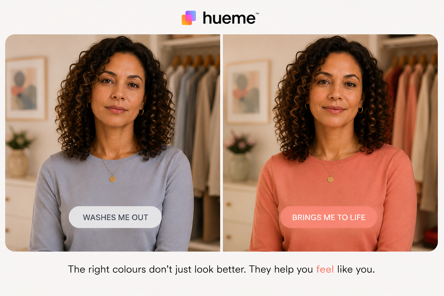
A colour can look genuinely beautiful on a hanger, in a magazine, or on someone else entirely. That doesn't mean it will work for you. And this is the part most of us have never been shown how to navigate, because we've been choosing colours based on what we like. Which sounds entirely reasonable. But liking a colour and being suited to a colour are two completely different things.
Think about it in everyday terms. A warm golden mustard might look rich and interesting on the rail. On some women it glows. On others it makes the skin look grey and the face look tired. The coral blouse that looked alive in the changing room mirror somehow looks flat at home in daylight. The icy blue your colleague wears brilliantly somehow makes you look like you need a holiday.
None of this is about what's fashionable. It's about what happens when a specific colour sits next to your skin tone, your hair, your eyes. And the gap between this colour is beautiful and this colour is beautiful on me can be surprisingly wide.
The colour mistakes most of us make in store
These are the pairs that catch people out most often. Two colours that look strikingly similar under shop lighting but belong to completely different seasons and do very different things near the face.
Bright pinks that are easy to mix up. Orchid Punch and Magenta Flash are both vivid, saturated pinks with a purple undertone. Orchid Punch has warmth in it. Magenta Flash is cool and blue-based. On a Bright Spring, Magenta Flash can look harsh and cold near the face. On a Bright Winter, Orchid Punch looks slightly muddy where it should be crisp.

Orchid Punch
#C24CB8
Bright Spring
Magenta Flash
#C20EAE
Bright Winter
Neon limes that sit in different seasons. Lime Zest and Neon Lime look almost identical on a rack. Lime Zest is slightly yellower and warmer. Neon Lime is colder, more electric. A Bright Spring will find the winter version too stark. A Bright Winter will find the spring version slightly dull. A few degrees of hue is all it takes.
Lime Zest
#C7E04A
Bright Spring
Neon Lime
#E8FF00
Bright Winter
Dark browns that aren't the same brown. Chestnut Brown and Bitter Chocolate are both deep dark browns and look nearly identical on the hanger. Chestnut Brown has a warm golden undertone that works beautifully on Autumn complexions. Bitter Chocolate is darker and slightly cooler. Getting these wrong is one of the most common reasons a supposedly flattering brown coat just doesn't quite work.
Chestnut Brown
#4A2C12
True Autumn
Bitter Chocolate
#3E2A1B
Bright Spring
Desaturated pinks, Light Spring vs Soft Summer. Pale Orchid and Faded Orchid are both soft, muted, greyed-down orchids. The Light Spring version is lighter and has a delicate warmth. The Soft Summer version is darker, cooler, more ashy. On the wrong season, both can make the face look washed out or slightly heavy, even though they seem so gentle.
Pale Orchid
#E5C8E0
Light Spring
Faded Orchid
#B5A0AE
Soft Summer
Don't you just hate the changing room squint?
We've all done it. Standing in a fitting room holding two almost identical tops, tilting your head slightly, squinting into the mirror as though the answer might suddenly reveal itself. Which colour looks better? Which one makes me look fresher? Which one will I actually wear?
The trouble is that changing rooms are not always helping you. Fluorescent lighting, artificial daylight, warm bulbs, cool bulbs, different mirrors, different shadows. They all play tricks on the eye. A colour that looks rich, flattering and expensive in a fitting room can look completely different in natural daylight. Add in the excitement of shopping, a tempting sale rail and the hope that you've finally found the perfect piece, and it's easy to see why so many purchases feel right in the moment but never quite earn a permanent place in the wardrobe.
You bring it home. You hang it next to the clothes you already own. You try it on again before work on a Tuesday morning. And suddenly the magic has gone. That's often not because you made a bad choice. It's because you made the decision in the wrong light.
One of the simplest ways around this is to step closer to natural daylight and use Hueme Match. In around 30 seconds you can check how a colour relates to your personal palette and save it directly to your Hueme Swatch for future shopping trips. A lot easier than standing in front of a mirror wondering whether it's the colour, or just the lighting.
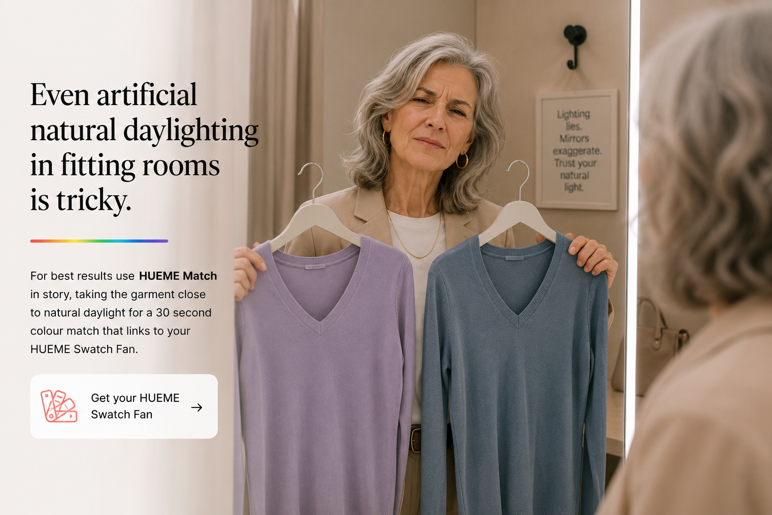
The colour that looked so alive under shop lighting looks flat on your skin in daylight. So you stop reaching for it. And the cycle quietly continues.
Worth noticing: think about the last time someone said you look great today. What were you wearing? Chances are the colour was doing something specific and positive for your complexion and you probably didn't clock it at the time. Your most worn pieces are probably already trying to tell you something.
Your wardrobe has been trying to tell you something
Think about the clothes you wear most often. The ones you reach for without thinking, on the days you want to feel your best. There's almost always a pattern and it almost always involves colour.
Many women are surprised to discover that their most worn pieces sit within the same colour family. Without ever formally learning anything about colour analysis, they've been gravitating instinctively towards the shades that harmonise with their features. The wardrobe has known all along. It just hadn't been listened to.
What it actually means to know your colours
Colour analysis sounds a bit technical. Possibly a bit eighties. Possibly involving being draped in fabric while someone peers at your face. And yes, that is sort of what it involves. But what it gives you is genuinely practical: a clearer sense of which colours work near your face, so that when you're standing in a shop or scrolling at midnight, you have real information rather than just a feeling.
It's the difference between knowing why something works and just hoping it might.
Once you start to understand what works for you specifically, not in general, not for the model on the website, not for the colleague who always looks effortless, shopping becomes a different experience. You develop a filter. A navy jumper might still be beautiful. A coral dress might still catch your eye. But you can quickly tell whether it's likely to become a favourite or a future wardrobe orphan. And that instinct, once you have it, saves a remarkable amount of time, money and early morning frustration.
Clothing is the single most returned product category in UK online shopping, accounting for nearly 20% of all e-commerce returns and costing the industry an estimated £7 billion a year (ScienceDirect, 2024). A significant portion of those returns happen because the item simply doesn't work once it's off the website and on an actual person, in real light, against real skin. Knowing your colours doesn't eliminate that entirely. But it does make you considerably harder to disappoint.
The easiest way to get it right in store
Hueme Match takes the guesswork out of shopping in real time. Point your phone at any fabric, paint chip, scarf or garment and it identifies the nearest colours within your seasonal palette, with a confidence score, in seconds.
It works alongside Hueme Swatch, your digital colour fan, so you always know exactly where a colour sits and whether it belongs in your wardrobe. Both are included with a Glow subscription.
One question worth asking before you buy
The next time you're tempted by something, try asking yourself honestly: can I picture wearing this five times in the next few months? Not at a fantasy dinner party or a life you're planning to have eventually. In the actual week ahead.
If the answer is yes, it's probably worth considering. If it feels uncertain, pause. You might be buying the garment for who you'd like to be rather than who you actually are on a Tuesday morning.
And if you consistently find yourself buying things that never quite work, the colours that quietly drain you, the pieces that don't slot in, the impulse buys that still have tags six months later, the problem probably isn't your taste. It's that you've never been shown which colours were working for you in the first place.
When colour feels right, getting dressed becomes a lot less complicated. And your wardrobe, finally, starts to earn its keep.