
You're sitting in a colour studio. One drape after another goes up against your face, and the verdict lands: Spring. Most of it makes sense. Then you notice something. The friend being analysed beside you, also a Spring, comes alive in the brightest colours on the fan, proper dopamine dressing, while those same shades leave you looking a little drained. Stranger still, a few of the softer Light Summer colours you try almost as an afterthought feel right too. Some sit beautifully, some feel slightly off, and neither palette is completely wrong. So you start to wonder. Am I between two seasons? Is that even a thing?
It is. And it's more common than most colour guides will tell you. Working out why is how you find where you really sit.
Colour seasons are not boxes. They're a spectrum.
The twelve season system works by dividing human colouring into groups based on three main qualities: how warm or cool your skin undertone is, how light or deep your overall colouring is, and how clear or muted your complexion appears.
The system is useful and practical. But it's also a set of categories applied to something that is actually continuous. Human colouring doesn't come in twelve distinct types. It comes in an infinite range of variations. The seasons are the map, not the territory.
Which means some people sit comfortably in the centre of a season, unmistakably a true Spring with no real doubt about it. Others sit closer to the edge, right where one season meets its neighbour, a Light Spring being a good example. Both are perfectly valid results. And sitting near that edge is exactly what lets you, as a Spring, borrow from or dip into Light Summer. Colour analysts call this adjacency. You still land in one season, decided by your undertone, but you share enough with the palette next door to wear a good part of it happily.
The science behind adjacencies
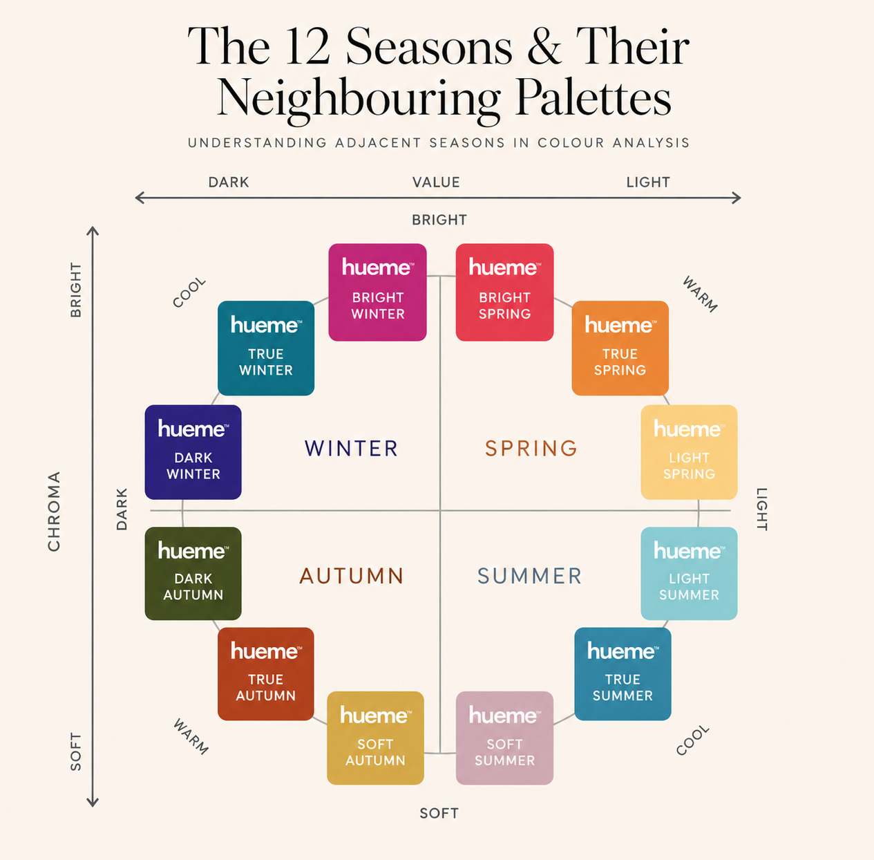
This chart explains the science behind these inter-seasonal crossovers, known as adjacencies. At first glance it might look a little intimidating, but it's actually quite simple.
Think of it as a map of the twelve colour seasons. The closer two palettes sit to each other, the more qualities they share. That's why a Light Spring may borrow some colours from Light Summer, or a Soft Autumn may find certain Soft Summer shades surprisingly flattering.
The chart shows how the seasons flow into one another, helping explain why some people sit comfortably between two neighbouring palettes rather than fitting neatly into a single box.
Don't worry about memorising it all. We'll break it down step by step.
The four types of neighbouring seasons
Seasons neighbour each other in predictable ways. Understanding which two seasons feel close to you often tells you something specific about your colouring.
Light Spring and Light Summer are both light and delicate. The difference is warmth. Spring leans golden, Summer leans cool.
Soft Summer and Soft Autumn are both muted and easy. The difference is temperature. Summer is cool-muted, Autumn is warm-muted.
Bright Spring and Bright Winter both love intensity. The difference is warmth. Spring brights are golden-warm, Winter brights are icy-cool.
Deep Autumn and Deep Winter both carry depth. The difference is again warmth. Autumn depth is earthy, Winter depth is cool and high contrast.
If you find yourself consistently drawn to both palettes in a pairing like this, the reason is usually that your colouring sits close to the boundary between them. Not in a frustrating way. In a genuinely informative way.
Light Spring and Light Summer: the delicate dilemma
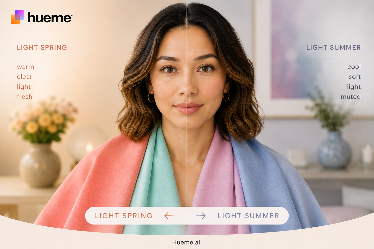
This is one of the most common areas of confusion. Both palettes are soft and low contrast. Both suit people with light, low-contrast colouring. Both contain soft pinks, gentle blues and easy neutrals that work near the face without overwhelming it.
The question is always warmth. Light Spring colours have a golden, slightly honeyed quality, even when they're soft. Light Summer colours have a cool, slightly ashy quality, even when they're gentle.
Think of Coral Pastel, the soft warm pink in the Light Spring fan, against English Rose, its quieter, cooler cousin in the Light Summer fan. Both are gentle. Coral Pastel has a peachy glow underneath it. English Rose has that glow taken out, a touch cooler and more powdery. Held near the face, the wrong one will sit slightly flat, even if you can't say why.
Light & delicate
Light Spring or Light Summer?
Light Spring and Light Summer are both light and delicate. The difference is warmth. Spring leans golden, Summer leans cool.
Coral Pastel
#FAA7B0
Apricot Petal
#F4C9B8
Spring Mint
#B7E4C7
Powder Blue Sky
#A9D6E5
Spring Lilac
#C9B8E0
English Rose
#F1B6C0
Powdered Quartz
#E6D3D8
Soft Verdure
#CDE0D2
Powder Sky
#AFCCEF
Lilac Frost Light
#C8B0C8
The clearest tell tends to live at the far ends of each palette rather than the soft middle. The warmest yellows of Light Spring, the coolest greys of Light Summer. One end will feel comfortable and the other faintly off, and that is usually a cleaner signal than the soft pinks, which can sit happily on either side of the line.
Soft Summer and Soft Autumn: the muted middle
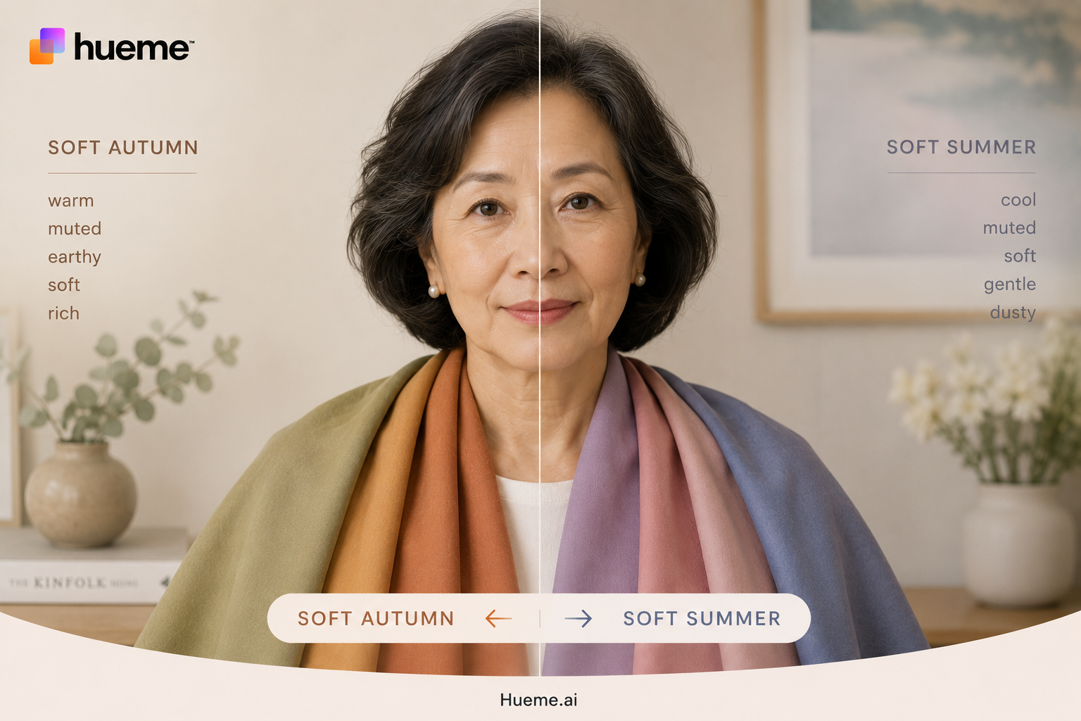
This pairing trips up a lot of people, particularly those who gravitate towards earthy, understated tones and find bright colours overwhelming regardless of season.
Both Soft Summer and Soft Autumn are muted palettes. Neither contains anything particularly vivid. Both work well on people who tend to feel washed out in very saturated colours and who naturally reach for dusty, blended, complex shades rather than anything sharp or primary.
Put one dusty rose from each fan together and the difference shows itself. Faded Antique Pink sits in the Soft Summer fan, a greyed, cool-toned rose with no warmth in it. Clay Rose sits in the Soft Autumn fan, the same dusty softness but warmed through, closer to terracotta. Both are muted. One leans cool and grey, the other warm and earthy. If you can wear camel and still feel at home in slate blue, you may genuinely sit on this boundary.
Muted & easy
Soft Autumn or Soft Summer?
Soft Summer and Soft Autumn are both muted and easy. The difference is temperature. Summer is cool-muted, Autumn is warm-muted.
Clay Rose
#C28E84
Pebble Cream
#C2A892
Sage Olive
#92A07E
Dusty Denim
#7A95A8
Dusty Lavender
#A89AB5
Faded Antique Pink
#C2A8AE
Faded Pearl Mauve
#A89EA0
Soft Spruce
#A0B0A8
Cool Fog Blue
#B8C8D8
Smoky Lilac
#9C8E9C
A useful test: look at the neutral end of each palette. Soft Summer's neutrals run cool, all mushroom greys, ashy taupes and dusty blue-greys. Soft Autumn's neutrals run warm, all sandy beiges, muted khakis and dusty terracottas. Which set feels more like your wardrobe already?
Bright Spring and Bright Winter: the intensity question
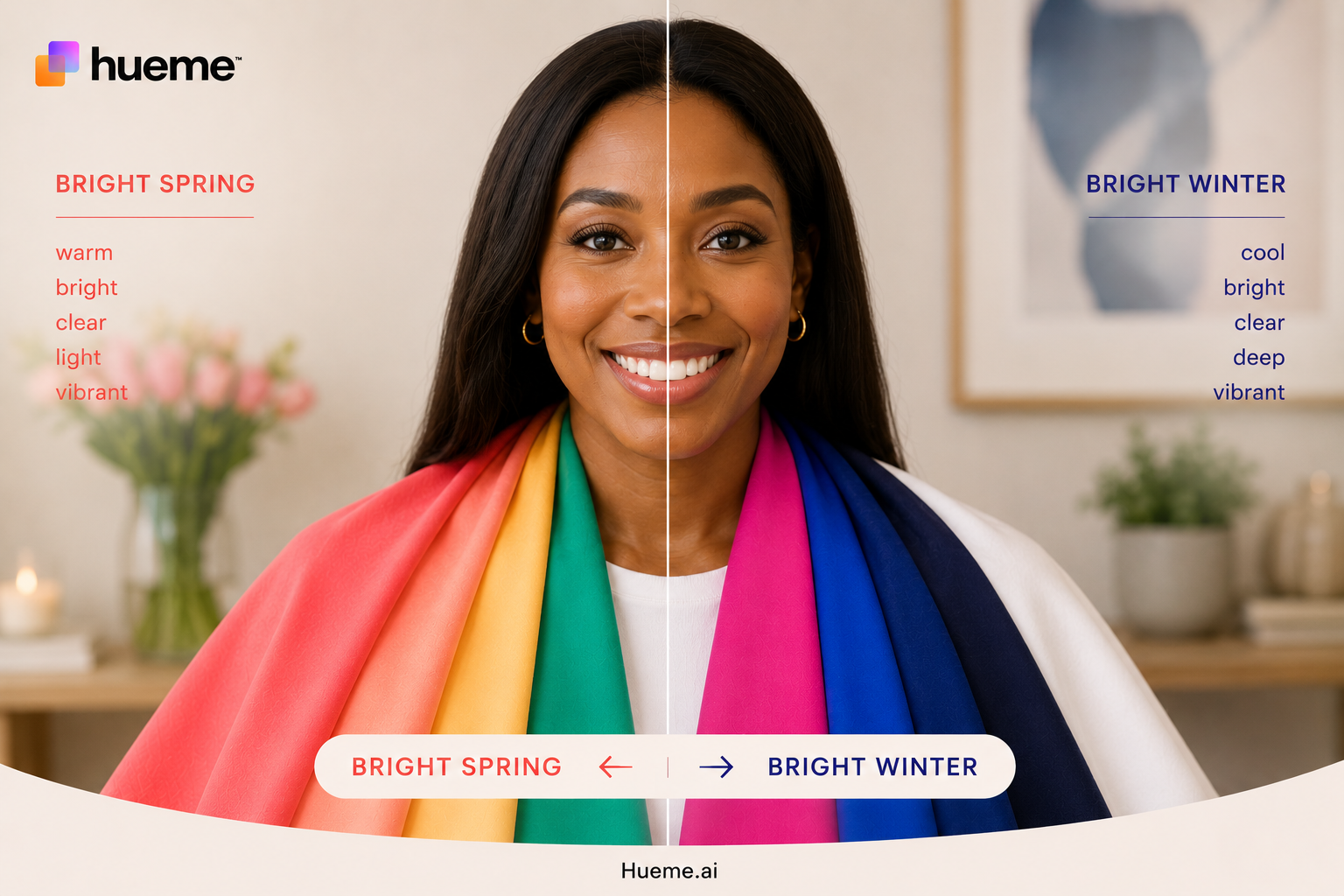
People in this boundary tend to know they love colour. They're not drawn to muted or dusty tones. They feel most alive in something vivid and clear. The question is which direction that intensity runs.
Bright Spring colours have a warm glow underneath them, even when they're vivid. Think of Orchid Punch, the bright warm pink that sits in the Bright Spring fan, versus Magenta Flash in the Bright Winter fan. Both are strong, saturated pinks. Orchid Punch has warmth. Magenta Flash is cooler and bluer. The wrong one near your face will be noticeable, even if you can't immediately say why.
Vivid & clear
Bright Spring or Bright Winter?
Bright Spring and Bright Winter both love intensity. The difference is warmth. Spring brights are golden-warm, Winter brights are icy-cool.
Tulip Coral
#FF4F58
Bubblegum
#FF7AA8
Orchid Punch
#C24CB8
Bright Turquoise
#75F4E8
Citrus Pop
#FFED3B
Scarlet Pop
#FF2E2E
Electric Fuchsia
#FF1F8F
Magenta Flash
#C20EAE
Electric Blue Pop
#00B7FF
Neon Lime
#E8FF00
If you love bright, vivid colours but warm corals make you glow and cool magentas feel harsh, you're likely Bright Spring. If sharp, icy, high-contrast colours feel most like home, Bright Winter is probably where you sit.
Why quizzes and charts often land you on the edge
Most online colour quizzes work by asking you to describe your features: eye colour, hair colour, skin tone. The problem is that these descriptions are inherently imprecise.
You might describe your skin as warm beige when it's actually quite neutral. Your hair might look golden-brown in summer and ashy-brown in winter. Your eyes might shift between grey and green depending on the light. Every one of those ambiguities pushes the result towards the boundary between two seasons.
This is not a failure of the quiz. It's a limit of self-assessment. Colour analysis, done properly, is a visual process. You need to see colours held against the face, not described in words, to know for certain which season fits.
What being on the boundary actually means for your wardrobe
If you genuinely sit on the boundary between two seasons, there is practical good news. The colours that sit in the overlap zone between your two candidate seasons will nearly always work. That middle ground is your most reliable shopping territory.
For someone between Light Spring and Light Summer, soft warm pinks and gentle peach tones that aren't too golden will likely suit them from either palette. They might find the warmest yellows of Light Spring or the deepest cool greys of Light Summer less flattering, but the middle ground is generous.
The trickier colours are the ones at the edges of each palette. The vivid warm yellows at one end, the cool icy lavenders at the other. These are the purchase decisions worth pausing on in a shop.
The boundary rule: when shopping from the overlap zone, the colours most likely to fail you are the extreme ends of each palette. The warmest warm shades from one season and the coolest cool shades from the other. Everything in between is usually safe territory.
How to settle the question
If you've taken the Hueme quiz or uploaded a photo to Hueme AI and you've come out as more than one season, or the result has felt inconsistent, don't worry. It usually just means you sit close to a boundary, and a few small tweaks will give you a much clearer answer.
Start by running it again in good natural daylight. Stand near a window, wear a neutral top (white, soft grey or oatmeal works well), tie hair back, take off heavy makeup and use a plain background. Do it two or three times and take the best out of three. Most of the time, that alone is enough to settle it.
If you still come out between two seasons after that, take it as useful information rather than a problem. You sit on the edge of two neighbouring palettes, which means both have colours that will genuinely suit you. This is exactly what adjacencies are about. Colour isn't about being filed into one of twelve boxes. It's about knowing which shades flatter you and giving yourself permission to pull from more than one palette when it makes sense.
The most practical way to explore this is in store, with Hueme in your hand. Open Hueme Swatch and put both palettes side by side so you can see where they overlap and where they part ways. Use Shop mode to go full screen on a colour, then hold your phone next to garments on the rail to compare. Use Hueme Match to point your phone at any fabric and see instantly how close it sits to your palette.
When something looks promising, take it over to the window. Natural light in store is the deciding vote. Hold the fabric under your chin and watch your face, not the fabric. The right shades lift you. The wrong ones drag. After a few tries you'll start to see the pattern, and the boundary stops mattering.
You don't need a perfect answer to start dressing well
The goal of colour analysis isn't to pin you precisely to one of twelve categories and lock you there. It's to give you enough information to make better decisions than you were making before.
If you know you sit somewhere between Light Spring and Light Summer, you already know more than most people. You know which colours to approach carefully and which to reach for with confidence. You know that soft warm pinks are likely safer than sharp cool mints. You know that vivid yellow and icy grey are both worth approaching with a pause.
That's genuinely useful. Even without a definitive answer, you can build a wardrobe that works considerably harder for you than it did before. And when colour is right, you won't be in any doubt. You'll know.
If you want the full picture, Hueme Glow is our most popular plan and the one we'd recommend here. It unlocks every colour in your season (and your neighbouring one, so you can explore adjacencies properly), the full Hueme Swatch fan, and Hueme Match in store. You don't need to pay for a professional analyst to get a clear answer. Hueme can be the answer.